
Similar to my Standard Brewing project, I wanted to create Altair as a speculative record label that could be used as a vehicle for various band and cover ideas. My initial concept was a fairly straightforward lettermark with a star, but after designing a fifties-style cover, I decided to go all in on an unabashedly vintage badge logo that’s more consistent with my current style.

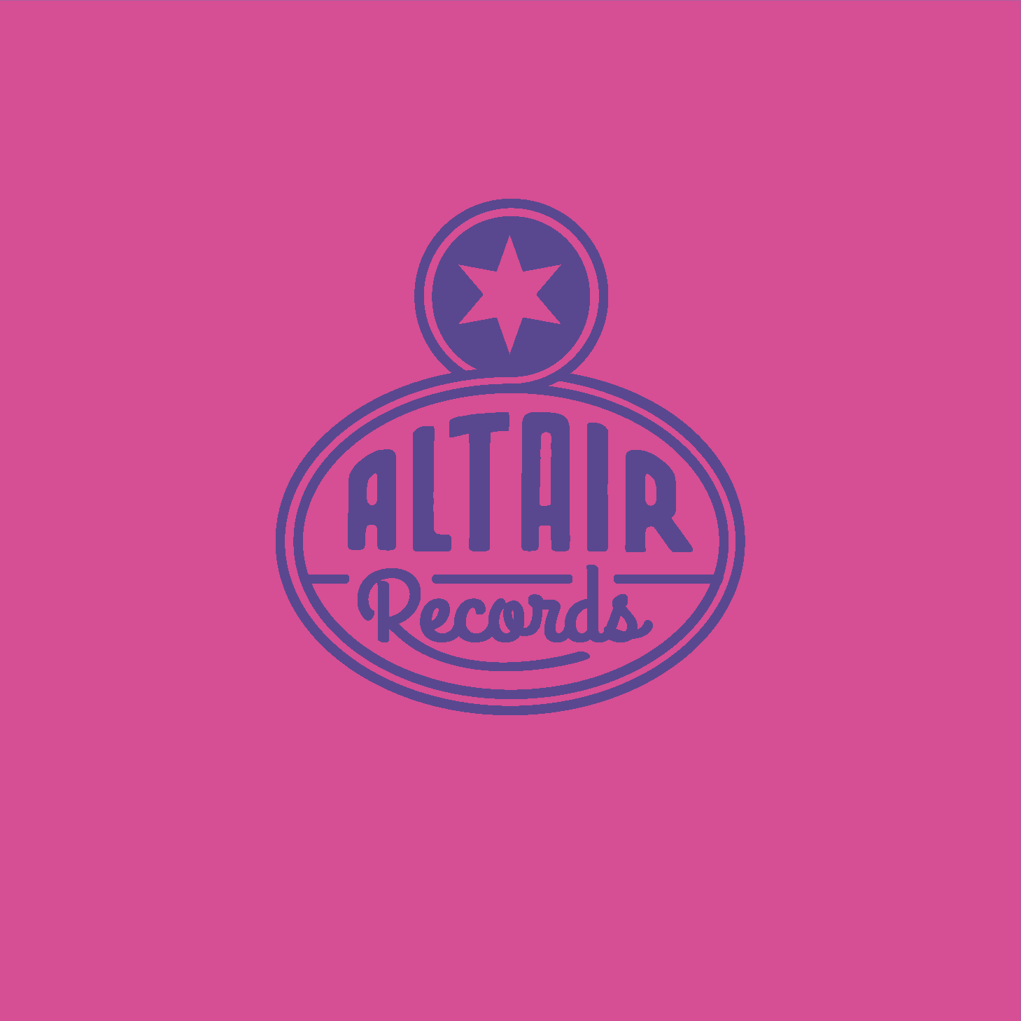
I imagined a small to mid-size record label founded in the 1930’s that somehow still existed– possibly after a few buy-outs. Naturally, independent music would be the primary offering.
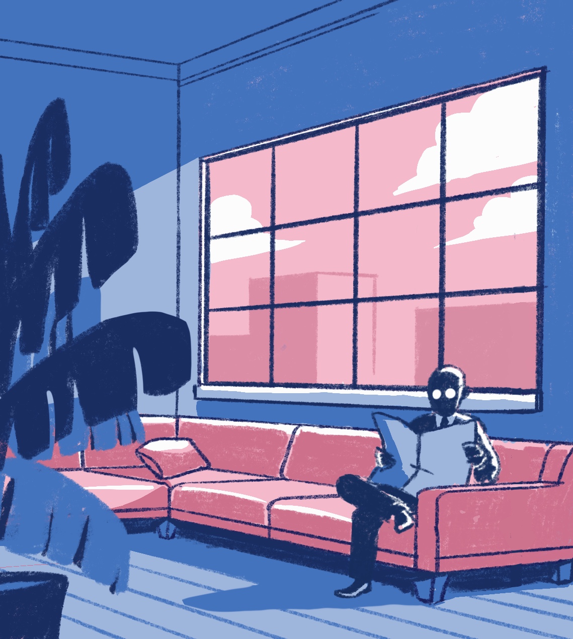
The Sera-Tones! All this came about from an illustration I came up with several years ago, when I first bought an iPad with Procreate. I was experimenting with perspective and interiors, and came up with the initial version below. I can’t really say for sure what my vision was– it was the kind of illustration that sort of just happens, but I know right off the bat that it’d make a perfect album cover. From there it went through numerous tweaks, until I ended up with the final product below. . .

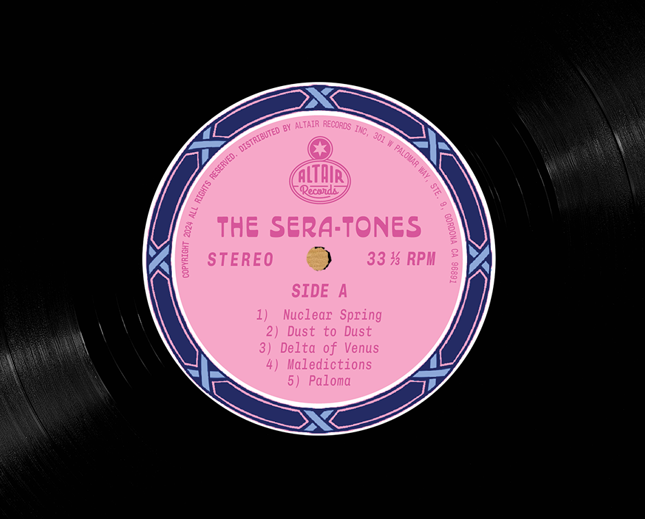
I’ve been wanting to experiment with decorative elements for a long time. Obviously the principle of “Less is more” was always hammered in at design school, but the notion of adding decorative elements for their own sake has a developed a certain subversive thrill. I went ahead with a relatively simple tile border inspired by traditional floral motifs, using the same colors as the main illustration to hold it all together. Beauty and death, all in one. Font is Allora by Damn Type Co.
I imagine the Sera-tones as sounding a bit Cannons, or Cigarettes After Sex. Languid, atmospheric, and with a hint of melancholy.


I have to give a shoutout to flyerwrk for the distressed-style mockup template. This is how I like to imagine my concepts; a little grungy and beat-up from daily use.
