

Similar to my matchbox project from earlier, I had an absolute blast working on this particular idea. My inspiration? The various off-brand products I used to spot on sale at the Asian and ethnic stores where my parents used to shop in the nineties. This being a speculative project, I was able to follow my flights of fancy to my heart’s content.

I was inspired by the branding for Angostura Bitters. Have you seen a bottle of the stuff lately? Bafflingly weird design; a literal wall of text, multiple official-looking emblems, a signature, and a nonsensically bouncy word mark that clashes with everything. And yet its a legend! I decided to let the spirit guide me, and see what came up.
The “K&G” logo was actually inspired by a western wear company that incorporated a cameo-sized landscape. It’s not a style of logo I’m used to creating, but it has a specifically dated feeling that was perfect for this project, especially with the “Low-res” style, meant to imply cheap printing.
My biggest goal, which might well run afoul of marketing teams everywhere, was to create a brand that invokes a sense of subtle ambiguity Is this a hidden gem that flies below the radar, or cheap tea sweepings that may give you lead poisoning?
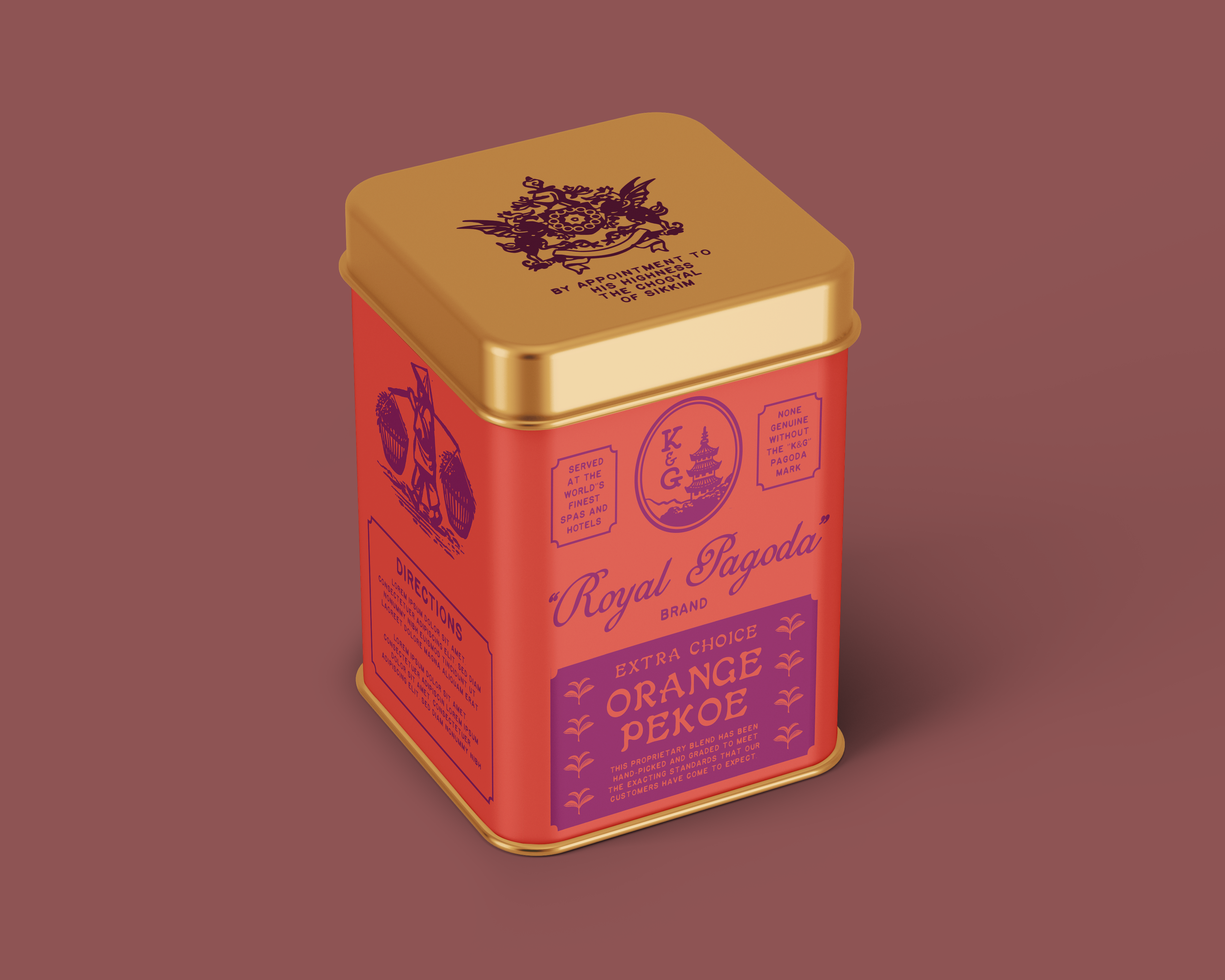
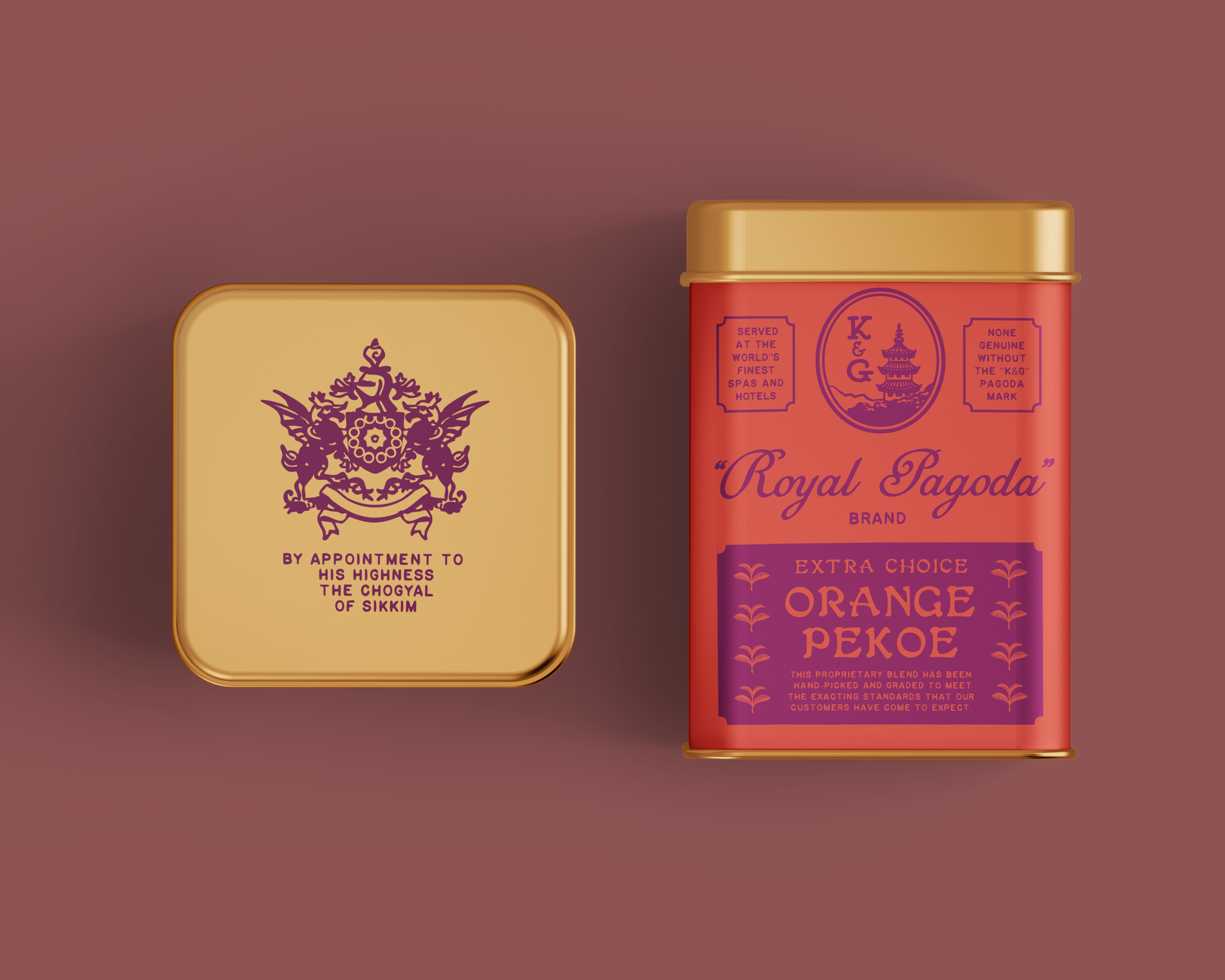
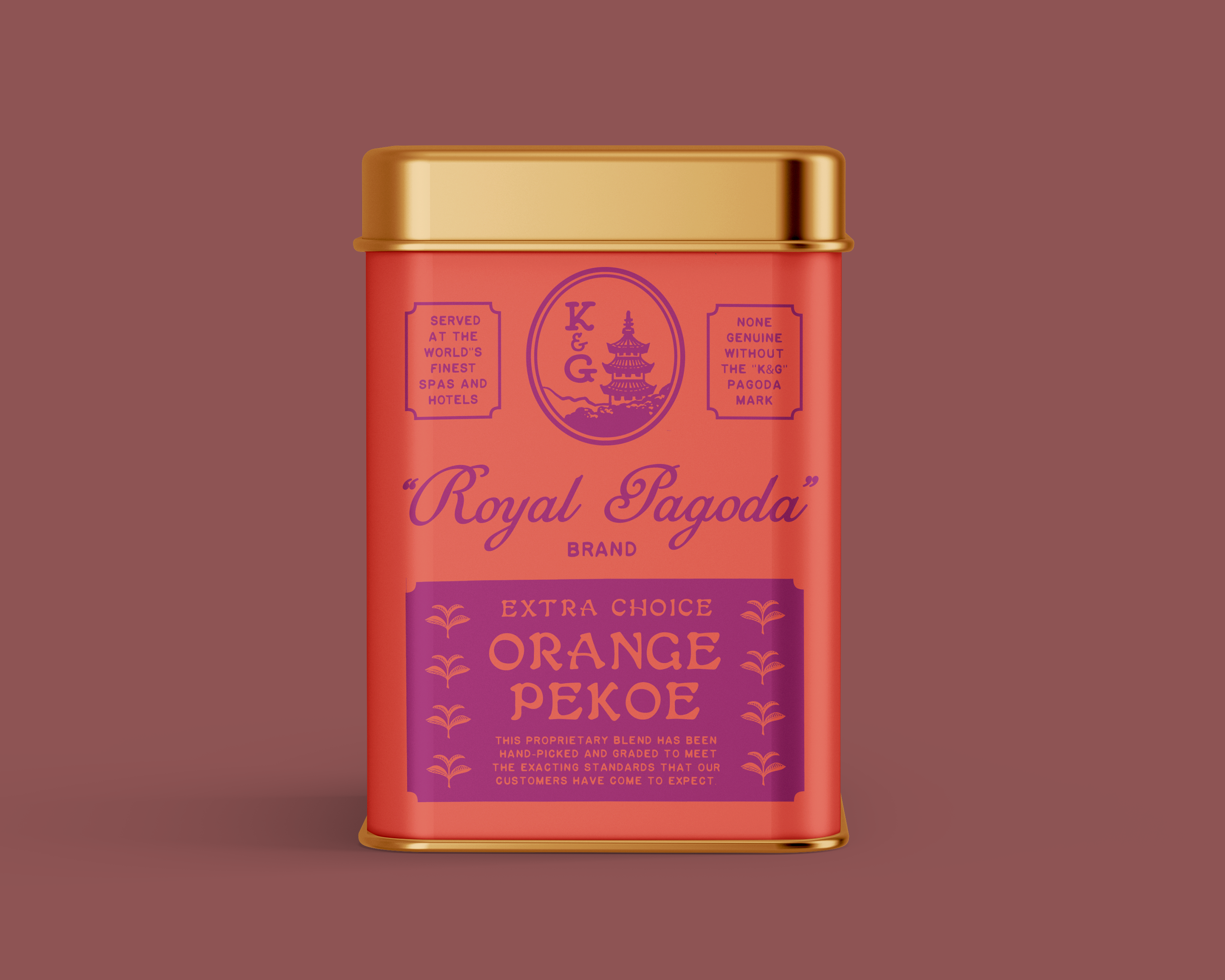
I made the brand name and the company name separate, which is an approach I sometimes see on old school Chinese medicine brands. “Royal Pagoda” is deliberately intended to sound like either a poor translation, or a clunky attempt to present itself as an exotic, “high-end” product to a gullible mid-century western consumers. In the spirit of Angostura Bitters, I also turned the rule of “Show, don’t tell,” on its head. This is a brand with a lot to say about itself all over its packaging! As an additional extra, I created an emblem of a fictional royal warrant from the (formerly very real) Princely State of Sikkim to grace the lid. A royal warrant is an official seal of approval from a royal family to any company that supplies them with goods or services that are deemed to be of exceptional quality. Did the Prince of Sikkim actually hand out such warrants? Since the statelet was absorbed into India in 1975, there’s no way of knowing for sure!


Finished off a loud two-color pallet. Fonts by Beth Matthews, Brandon Nickerson, and James Coffman. Super fun project, would do again!
