
Beverage labels have always an interest of mine. Living here in Portland, you can see some amazingly creative beer can graphics, especially coming from the local breweries. There’re two schools of brand design in this regard; Most feature the logo taking center stage, while the smaller ones minimize the branding in favor of elaborate illustrations, sometimes featuring wildly different styles from different artists. It should come as no surprise that this would appeal to me as a brand project! To get started, I decided to create fairly low-key brand identity with a variable palette that could elegantly fit on the top margin of a beer can and allow the illustration work to take center stage. I think of the brand like a solid, blue collar dad,, surrounded by his colorful, countercultural children, all with radically different personal styles and vibes, but still sharing a common family resemblance. And what could be more blue collar than “Standard?”

Let the freak flag fly . . .

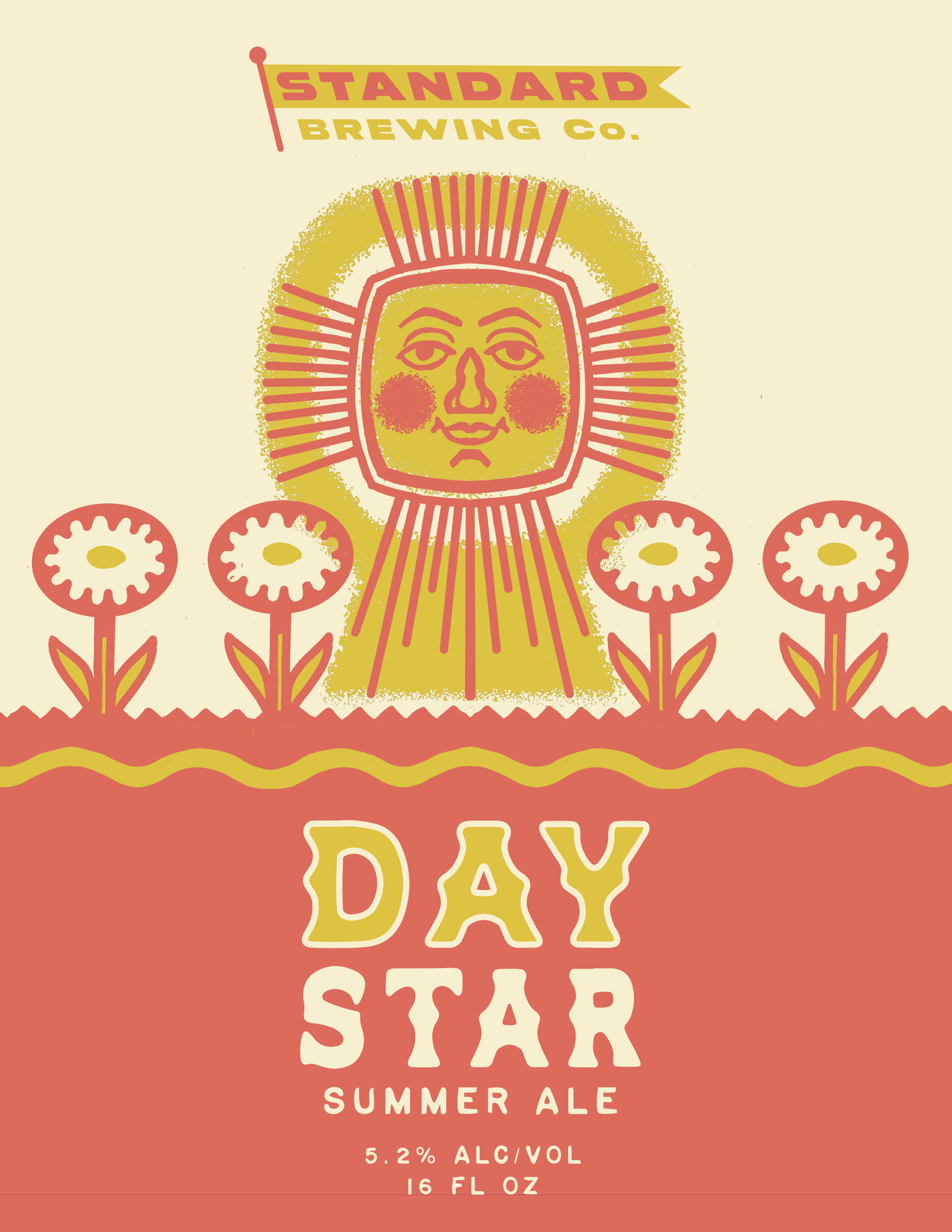
For the first concept I went with a summery illustration based on a certain crunchy, sixties-inspired eco-vibe. Lord of the Rings fans will of course notice the reference to Smeagol’s description of the sun. Summer ale it has to be– I would certainly crack open one of these at a beach picnic.

The final render, featuring the mockup talents of mockupdesign.com. Prost!
