
My primary hobby outside of the design and illustration world is Argentine Tango. For the uninitiated, this is a type of social street dance and musical style originating in Buenos Aires around the turn of the last century. Following a similar trajectory to vintage jazz in the United States, it burst into the worldwide scene in the 1920’s, reached its golden age in the 40’s, and then gradually declined as rock music took over from the 50’s onward. The 1990’s saw a revival initiated by tango stage show and films (Scent of a Woman, anyone?) with Argentine Tango communities and festivals popping up all over Europe and the United States. At the present moment, worldwide tango is a thriving but extremely niche subculture. It attracts engineers, musicians, and various bored professionals, and boasts its own celebrities (local and international), fashion trends, music, plus etiquette and customs; in addition, a pantheon of genre-defining musicians and composers with their accompanying stories, musical legacies, and myths. All of this was born, or descended from, Buenos Aires’ golden age of tango. Individual tango communities all over the world often incorporate regional history, themes, and traditions into their events, all while maintaining a connection to shared roots. The perfect springboard for visual exploration and storytelling!
In terms of creativity, however, tango typically is very inward focused; everything pertaining to the dance and the music understandably come first, and all else is secondary. You can find tango shoe and clothing brands, websites, festivals, and a handful of milonga social nights that have their own graphics branding, but it’s often not particularly memorable. Most incorporate clip-art style images (often silhouettes of dancers) or generic “fancy fonts,” and digital templates that get the job done. Very little is truly concept based.
For me however, I wanted visual richness off the dance floor as well as on it. Skateboarding is actually a pretty good analogy of what I’d love to create for tango — a style and visual culture deriving from a particular activity, but with broad enough appeal stand on its own — without, of course, sacrificing it roots, Last year I decided to create my own tango-focused lifestyle brand, simply as an excuse to explore this further. Below is an outline of the brand are a few examples of what I was able to create.
The brand itself
The title Verdemar is unsurprisingly, based on a very sad tango song about love and loss. Despite this, the word instantly struck me as irresistibly perfect; the sound of the syllables rolling off the tongue, the way it relates directly to tango history but also evokes a sort of mid-century glamour, plus the actual translation; sea green, which meshes perfectly with my website’s palette and stylized dolphin logo. It soon became clear that this would be less of a new entity and more of an expansion of the personal brand that I’d already created, through this website.
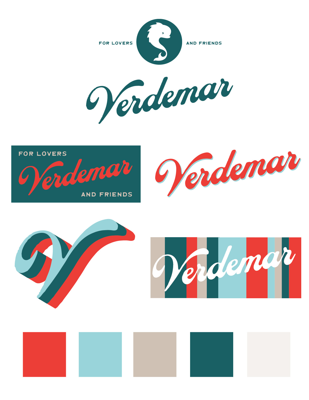

I decided on a fairly loose style for maximum adaptability. The main elements: four colors, plus a fifth variant, all originally designed as an expansion of my current brand colors, but never really used. The irregular “barcode” stripe pattern, the title itself, written in a classic script font courtesy of Brandon Nickerson, one of my favorite font designers. The primary tagline, “For Lovers and Friends,” and of course the signature dolphin roundel. The main focus is allowing the branding to be highly modular and variable. Within the constraints I’ve created, I’ve given myself leeway to use any of the elements with or without each other, in different ways and with occasional variations, such as a colored drop shadow.
The Cafe Dominguez Mug
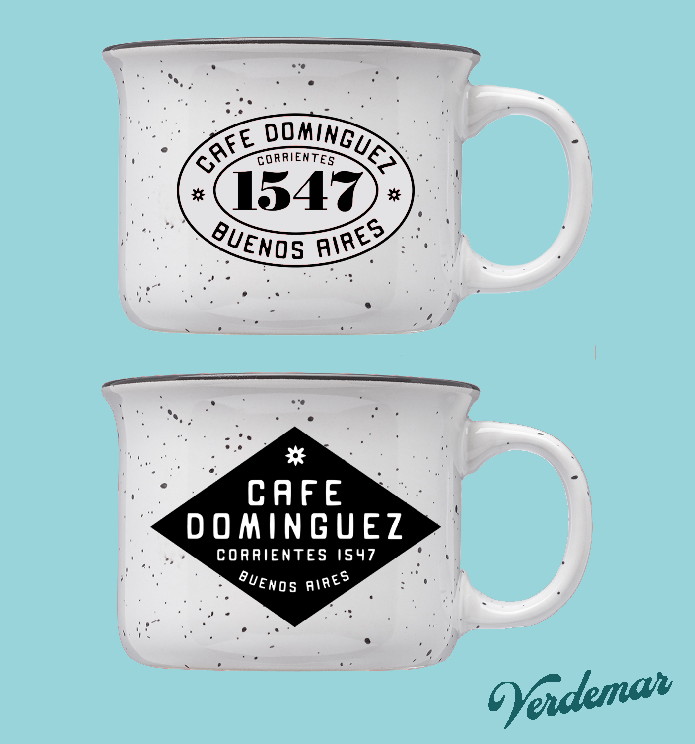
Two early mockups of a custom camp style mug. Cafe Dominguez was a famous coffeeshop that existed in Buenos Aires during the golden age of tango, and was the favored hangout spot of many well-known composers and musicians. The cafe even inspired its own tango song, but eventually faded into history some time in the fifties or sixties. I wanted to create something that paid homage to the song and the place– the top one features the historic street address prominently, and is inspired by traditional metal address plates in Buenos Aires. Like I described earlier, I wanted to create something inspired by tango lore, for tango dancers, but that exists as a beautiful object in its own right for anyone to enjoy. I feel this project was a definite success in this regard.
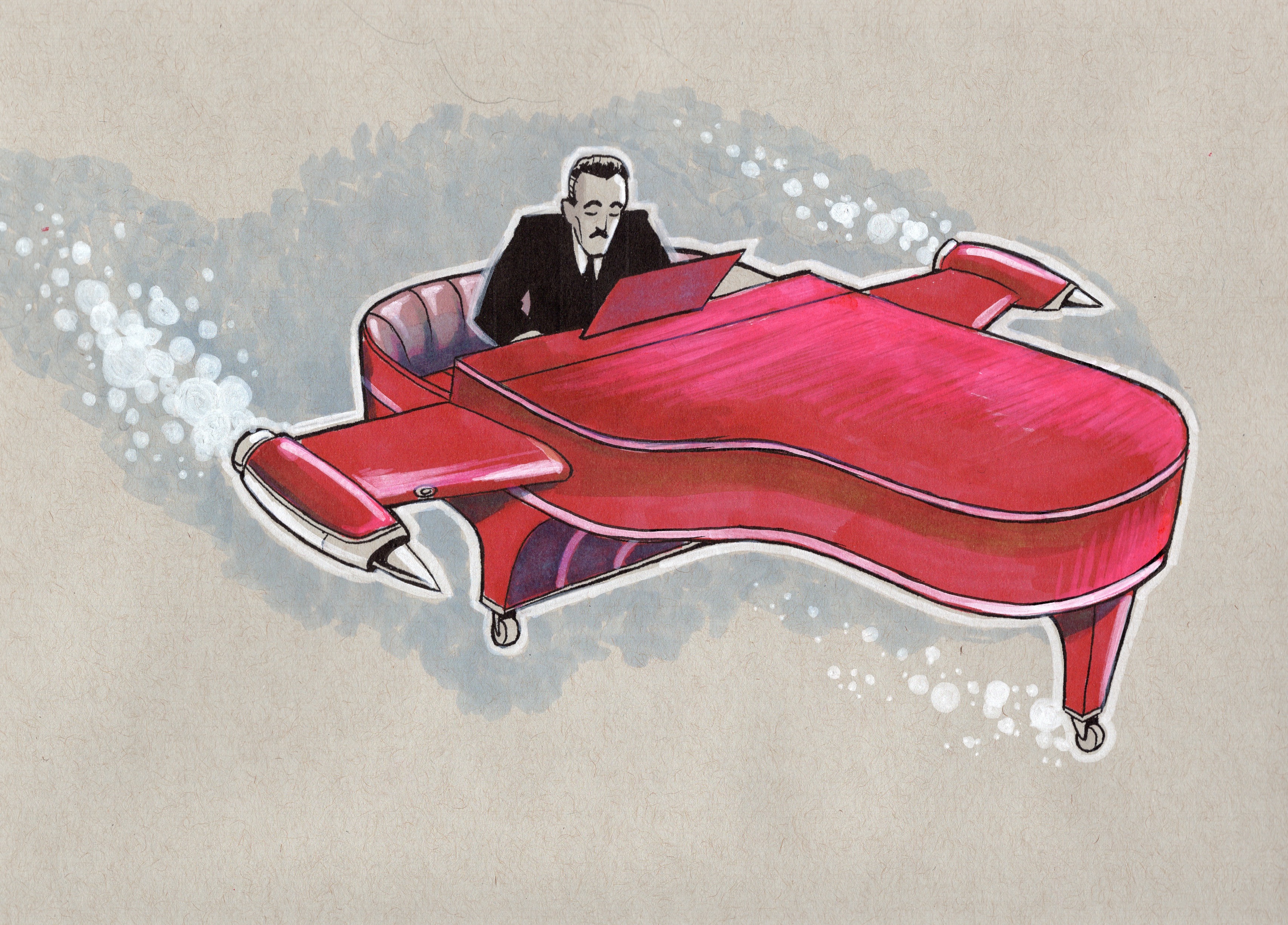
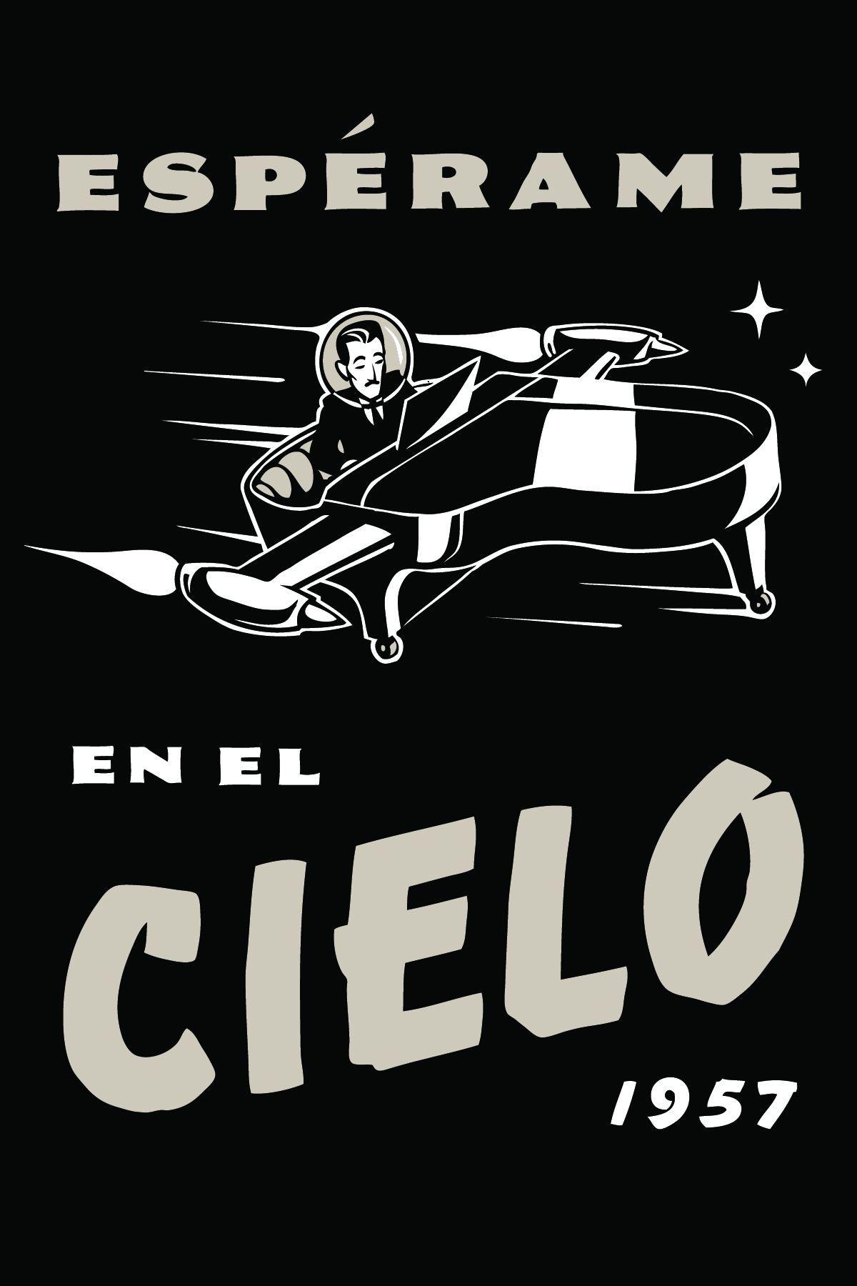
“Esperame in el Cielo” Shoe Bag

Another, more dancer-specific item that I decided to create was a shoe bag. This is a classic accessory for most dancers, and an ideal canvas for some of my concepts. I decided to rework an older design, using renderings of vintage speedball style lettering for the typography. Longtime follows of my website may well recognize the original illustration from a few years back; the pianist is Rodolfo “Manos Brujos” Biagi, a famous musician and composer from the golden age of tango. “Esperame in Cielo” refers to one of his classic later compositions from the 1950’s, hence the space age / sputnik theme.


“A MEDIA LUZ” SHOE BAG

Another shoe bag based on a tango song. “A Media Luz,” or “At Half Light,” is a rather unusual tango whose lyrics describes the interior of a well-furnished love nest in Buenos Aires. I’ve always found this to be an interesting choice, and from this concept sprung an image; A cupid with his candle, rendered in black, coyly shushing the viewer.
“Mala Suerte” Shoe bag

First off, cats are a wildly popular on everything; I’d have to be crazy not to do at least one tango cat piece! Secondly, I was able to fit two easter eggs into this concept. The title “Mala Suerte” of course references yet another tango, although not in fact about cats. The dark glasses were the signature accessory of Carlos Di Sarli, a prominent tango composer who was famously difficult to work with — so much so that a rumor got started that he was bad luck. In some quarters this legend still persists!
