Japonisme profile

Japonisme profile

For this I drew inspiration from Japanese aesthetics, and I have to say, I’m quite pleased with the result; time and effort certainly pays off in the long run! I’m hoping to create more stuff in this delicious style, with minimal colors, and a flat effect. This was originally going to be a new logo for my page, but as these things go, It got too complex to be adequately reduce-able. That, and it looks nothing at all like me!

Portfolio work — the Dynasty Trilogy

Portfolio work -- the Dynasty Trilogy

This is series of book covers I designed for my Graphic Design portfolio class. No actual story to go with them, sadly– just a vague “Hero’s journey” premise. Fairly simple to produce, too– like much of my other stuff, I simply Bitmap’d an inked drawing, created different colored “plates” on separate Photoshop documents, and then overlaid them to get that cool lithographed look.

IMG_0674 IMG_0680 IMG_0682

Inky Little Faces

Inky Little Faces

A full page of faces that I’ve been needing to post for a while now. I used a dip pen and india ink for the lines, and experimented a little more with ink wash for the shading.

Yes, they’re mostly bald, but hair is such a godawful pain. . . 😉

The Governor-General

The Governor-General

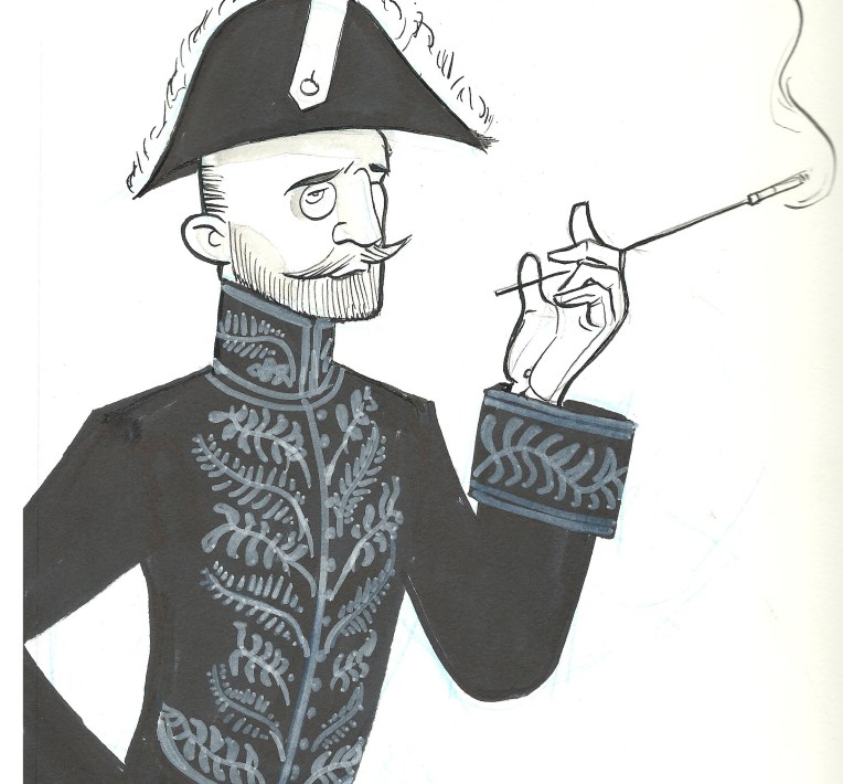
Here’s a Governor-General.

Not any particular one, just a random one all decked out in his finest Court uniform and cocked hat with plumes, looking just as splendid as a viceregal representative ought to. No more explanation is necessary, I think. . .

I used a white marker for the elaborate embroidery, although I think a dip pen and my trusty white india ink would have served me better.

Frazzled

Frazzled

More dip pen goodness. . . . she wasn’t originally intended to look frazzled, but her hair came out messy and then everything else naturally had to match.