
After many years, I’ve finally joined the iPad club! With access to Procreate, I’m able to do a hell of a lot more work within a much quicker timeframe. Below are a few recent ones.
beauty

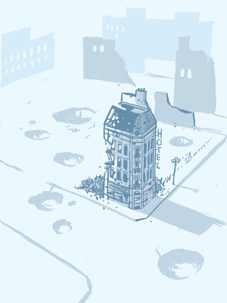


New Website
I’m excited to announce that my graphic novel project now has its own dedicated WordPress site, for your viewing pleasure. The journey continues here.

Rose Colored Glasses
This is actually an earlier sketch, with a bit of photoshop added. I decided to revisit it because it has more significance in relation to the rest of my illustration, as its main purpose is to convey emotion, rather than just to say “Hey, here’s a face I drew.” A wonderful piece to look at. I’d love to trace it and turn it into something more complete, but it would lose the sublime, spontaneous style that can only really happen in the moment.

Curious Business
Whiskers is dreadfully confused; what on earth could Mistress be doing on the floor? Perhaps she’s turning into a cat.

Lingerie and Cushions

Sometimes the urge strikes one to draw something a little more risqué than usual. Continue reading
Glamour with Colors
I dug this lovely face out of my drawer of past projects. Pieces like this always remind me of the beauty of shapes and colors, in addition to just lines. Its a style worth perfecting . . .

White on Black
Another one from the vaults! I haven’t been drawing as much as I ought to be lately, so here’s an old Illustration assignment from my Graphic Design classes last year. Its a scratchbord etching, scratchbord being a white clay tile with a thin layer of black clay on top. Considering that this and everything else in the scratching/etching family is aesthetically my least favorite medium, I’m quite happy with how it came out; all I can say is that It certainly pays to have a light touch . . . 
Japonisme profile

For this I drew inspiration from Japanese aesthetics, and I have to say, I’m quite pleased with the result; time and effort certainly pays off in the long run! I’m hoping to create more stuff in this delicious style, with minimal colors, and a flat effect. This was originally going to be a new logo for my page, but as these things go, It got too complex to be adequately reduce-able. That, and it looks nothing at all like me!
Formosa Girl

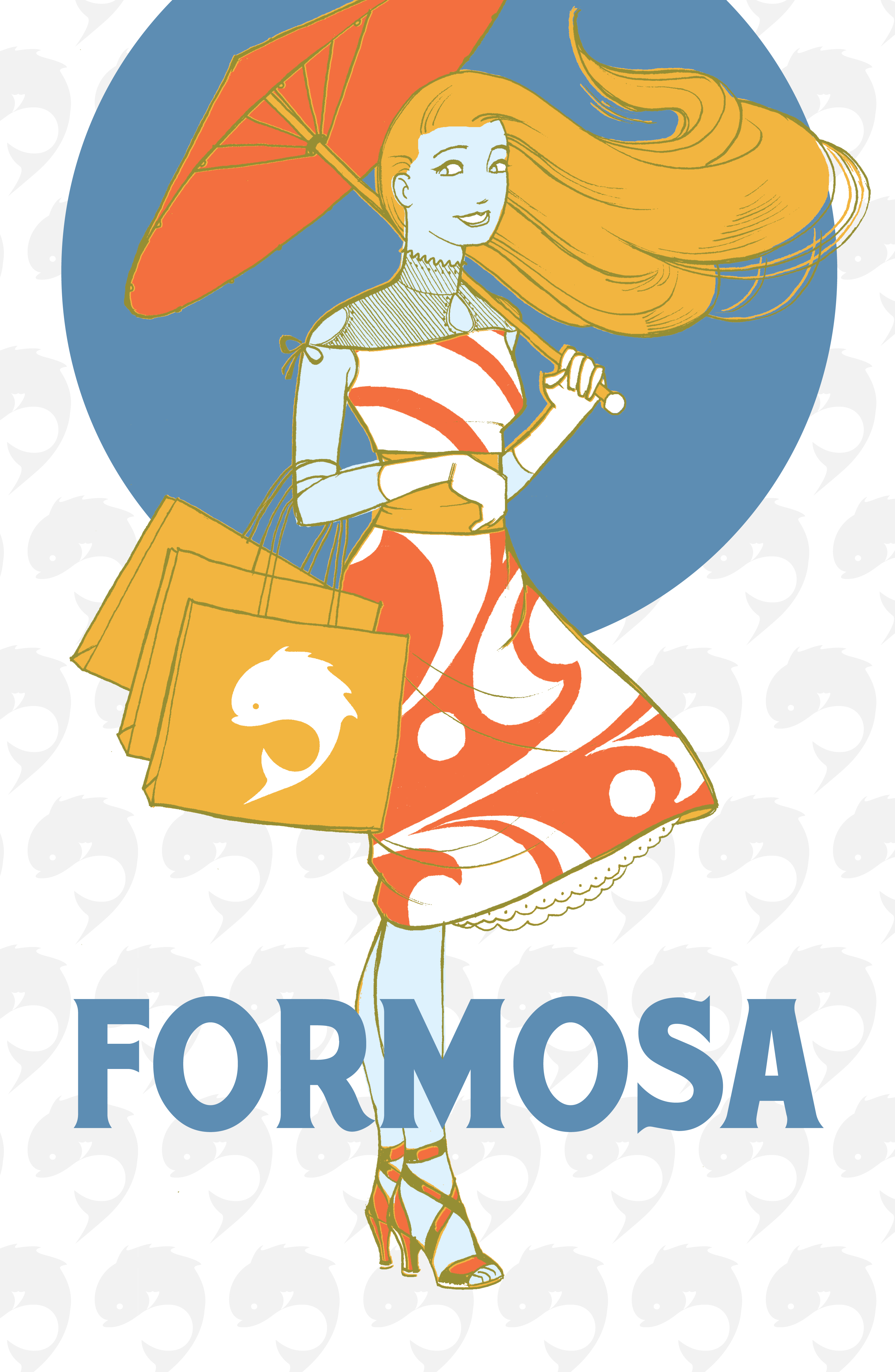

One of my favorite projects. I did the original one over a weekend, after learning I was way behind on one of my class projects. For my portfolio class I added two more to make a set, with color and pattern variations.
Formosa was a vintage fashion line for the sake of the project, but for me its a reference to an aesthetic paradise where everyone dresses well. ( see the link on my homepage. )
