


More dip pen goodness. . . . she wasn’t originally intended to look frazzled, but her hair came out messy and then everything else naturally had to match.

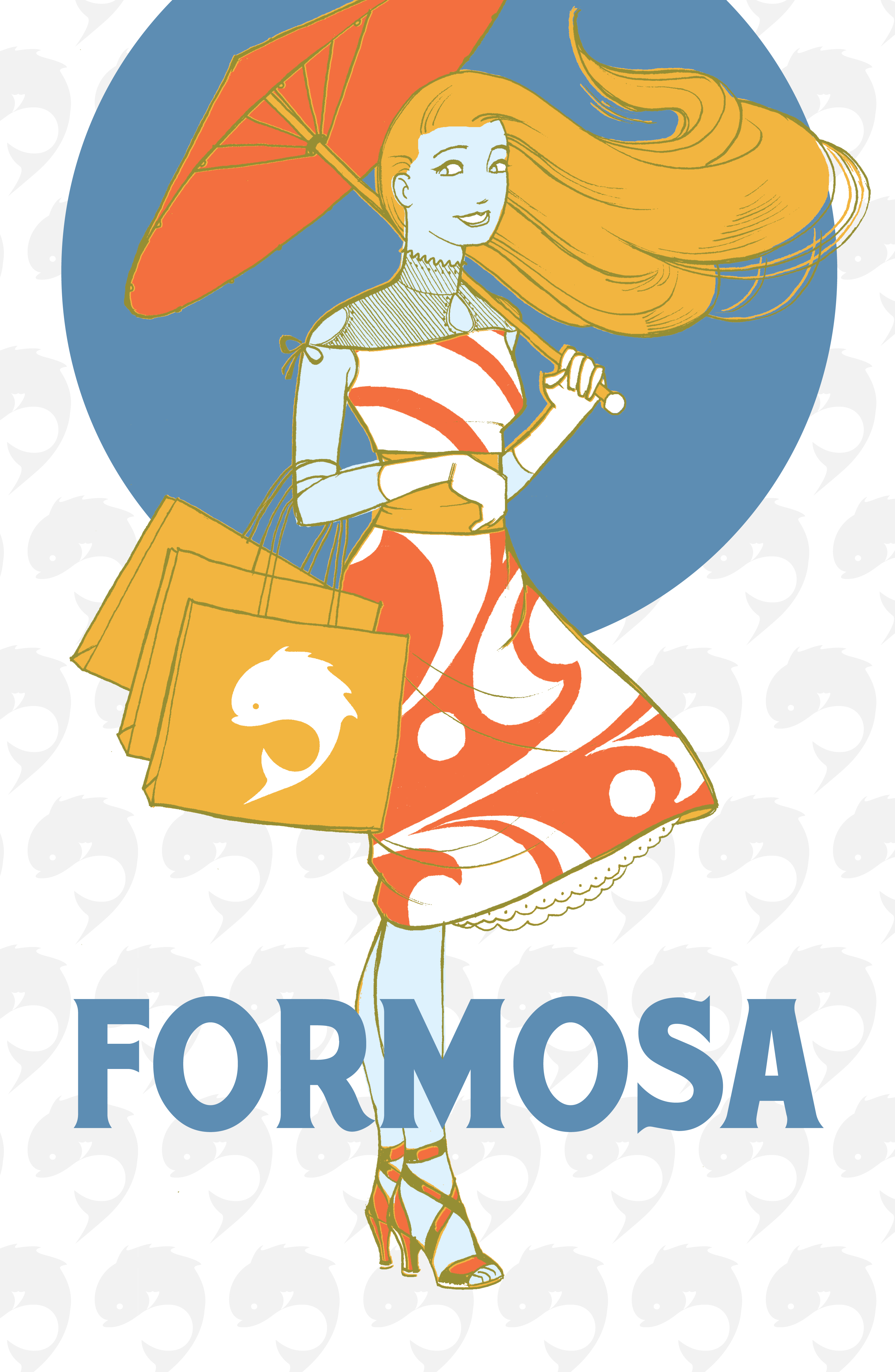

One of my favorite projects. I did the original one over a weekend, after learning I was way behind on one of my class projects. For my portfolio class I added two more to make a set, with color and pattern variations.
Formosa was a vintage fashion line for the sake of the project, but for me its a reference to an aesthetic paradise where everyone dresses well. ( see the link on my homepage. )
