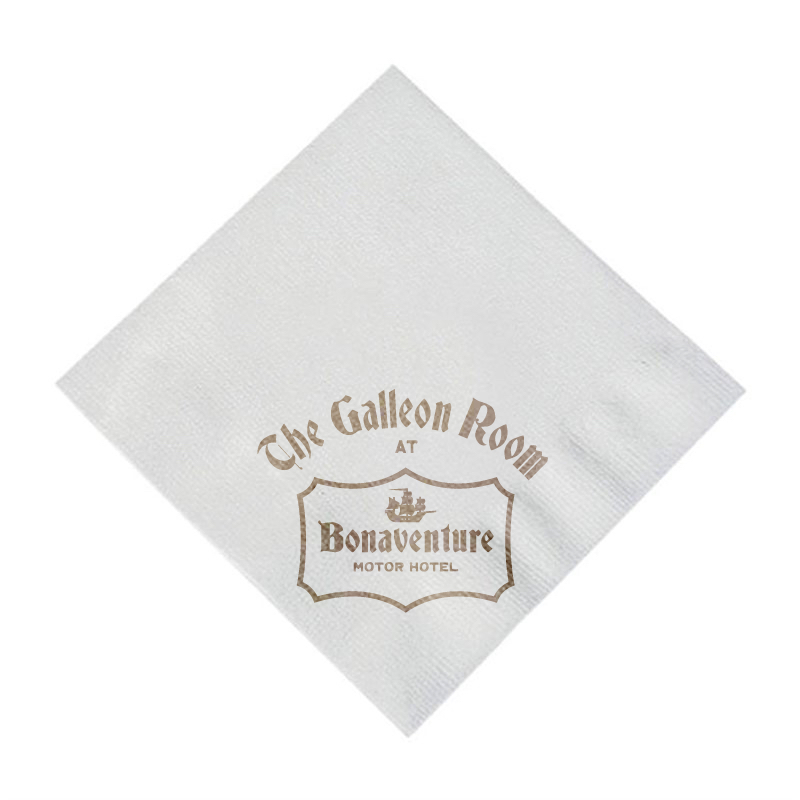
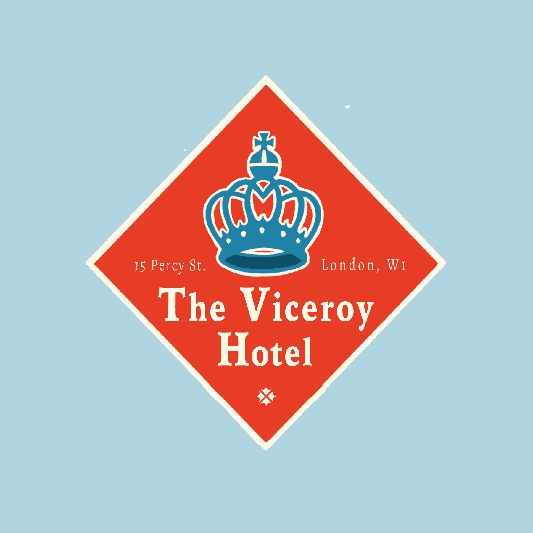
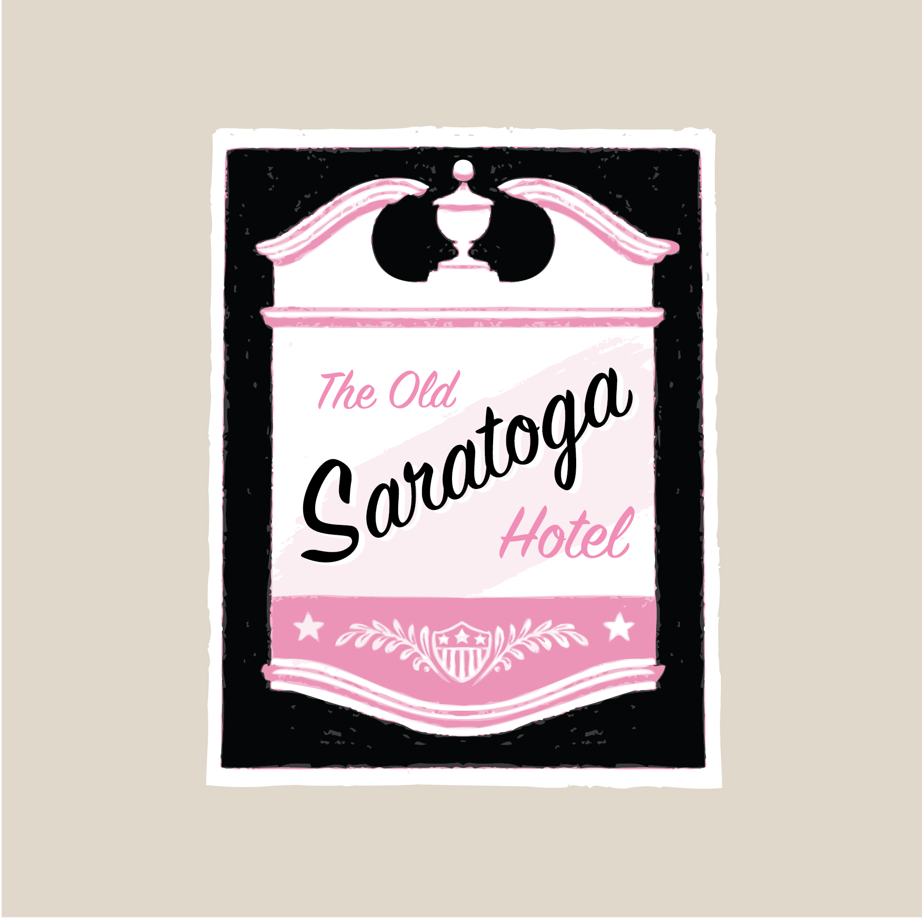
Some Wes-Anderson-inspired luggage tags for Hotels that don’t exist, but could exist.


Despite my dearth of posts, rest assured that I’ve definitely been productive as I slowly learn to take full advantage of my iPad’s capabilities. Most of my work has been going straight to Instagram, but I intend to be more consistent across platforms in the future. Here’s what I’ve been up to since I last posted…
Continuing the theme of vector line art against black. What I love about the orb as an article of royal regalia is the inherent minimalism. The top two quadrants represented Europe and Asia respectively, with the bottom half representing Africa– the only known continents at the time, with a cross naturally placed atop the whole business. I’m exceptionally proud of how this one turned out, both in terms of technique and atmosphere.
Cityscapes have been a long standing gap in my range of skills, partially because they take a lot more planning and references then just a quick character sketch. Perspective and scale has to be applied, windows have to align, and foreground, middle-ground, background, and all that good stuff has to be accounted for. Although it definitely taxed my patience at times, I feel my efforts paid off handsomely in this case, with the line-based, monotone style successfully evoking the midcentury look that I was going for. Next time around I’ll be adding higher contrast to the colored shadows, more detail, and maybe even some human figures. To be continued . . .
Logo practice: variations of my current dolphin logo, just for the heck of it. Bottom left is inspired by German police badges, bottom right by mid-century corporate logo design. Although I probably won’t use these particular ones, I’m planning on redesigning parts of my brand using the four-color palette shown.