
A stand-alone postcard/poster project, inspired by beauty pageants and midcentury illustration styles.

My first proper tabloid-size poster since my school days, inspired by a very famous tango composer that I’ve sketched before here . This is part of the new special branded collection of tango-related art and design that I’m in the process of creating, and will be adding to my site very soon. The headline type is adapted from a midcentury speedball manual from my personal collection, and the subhead is BN Gamma, by independent type designer Brandon Nickerson. Eventually I hope to create a mini-series of three featuring other famous orchestras in similar styles.

This was the first draft, in postcard form. Unlike the poster, this was created entirely on procreate with hand lettered type, and presented the usual challenge of balancing competing elements into a cohesive (and legible) whole — a challenge that I only accomplished by cropping poor Juan more than I would have preferred. I think it works much better on the posters size, as all the elements are able to speak for themselves unhindered.


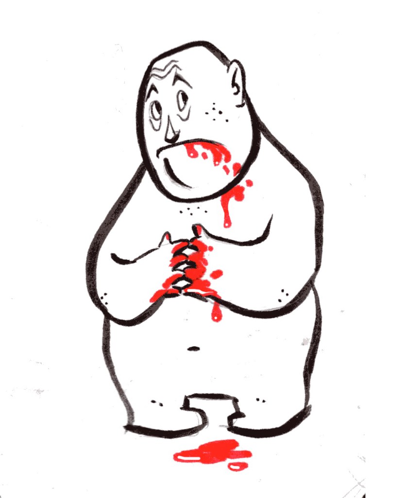
Good tips from the Alzheimer’s Association of Oregon and SW Washington, an excellent organization that I’m still working with them on a volunteer basis. Six down, four to go!

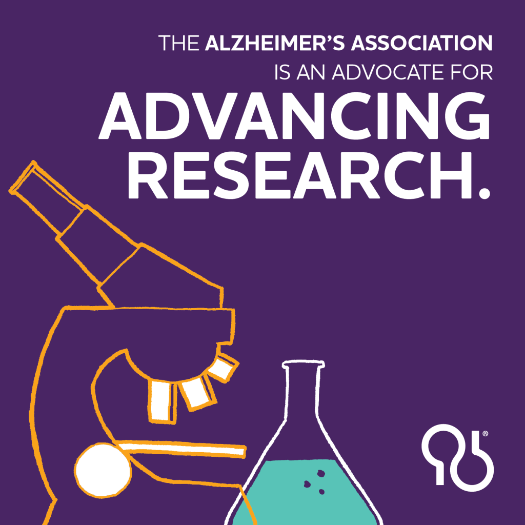
Much as I love it, I decided to take a break from wrangling scanned lineart in Photoshop, and instead to experiment with a very popular style of vector illustration that I’ve been wanting to try for a while. The results? So clean! So mathematical and precise! And a message we can at least aspire to.

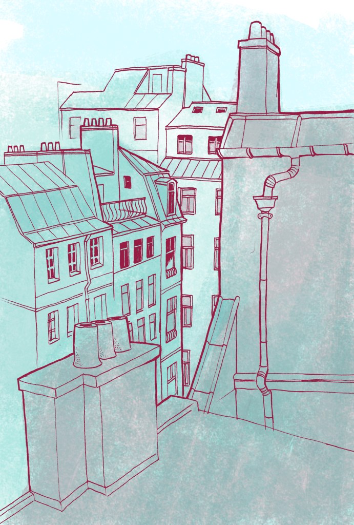
Cityscapes have been a long standing gap in my range of skills, partially because they take a lot more planning and references then just a quick character sketch. Perspective and scale has to be applied, windows have to align, and foreground, middle-ground, background, and all that good stuff has to be accounted for. Although it definitely taxed my patience at times, I feel my efforts paid off handsomely in this case, with the line-based, monotone style successfully evoking the midcentury look that I was going for. Next time around I’ll be adding higher contrast to the colored shadows, more detail, and maybe even some human figures. To be continued . . .
More social media work for the Alzheimer’s Association. For this project, I designed a simple illustrated slideshow that highlights the organization’s work and encourages the public to get involved.


As some of you may know, I have ongoing volunteer engagement with our local (Portland) chapter of the Alzheimers Association. My first project so far; promotional illustrations for social media.

For Portland Tango Festival 2019, I was commissioned to create a promotional T-shirt featuring a famous tango composer. The choice was clear from the start; Osvaldo Pugliese. Not only is he a towering figure in tango history , with both a famous and distinct likeness, but he also bears the nickname “San Pugliese,” which is just asking for a caricature! I went ahead with an vintage style in order to evoke the golden age of Argentine Tango, plus a bright but limited palette to make it pop against the black material. A true success.


mockup credit: printful.com
